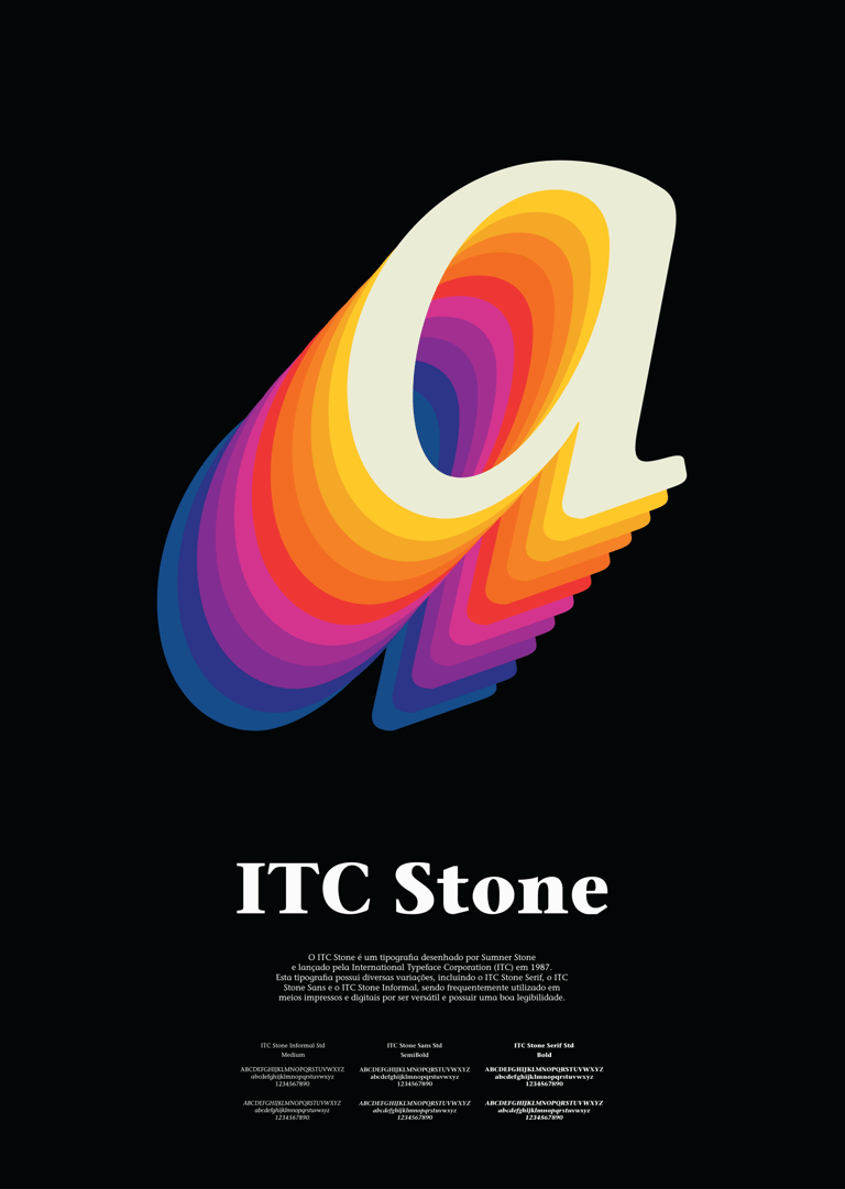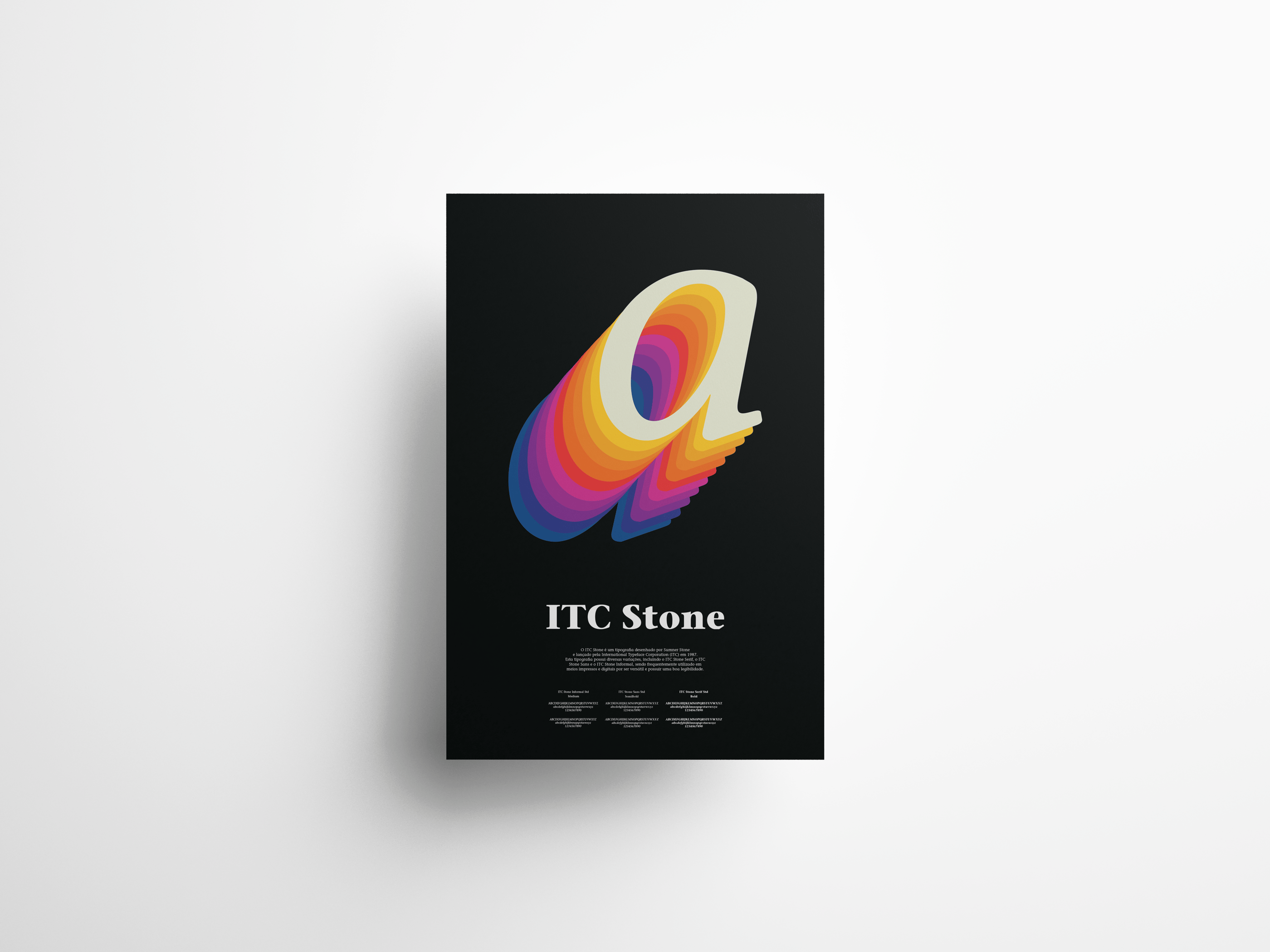
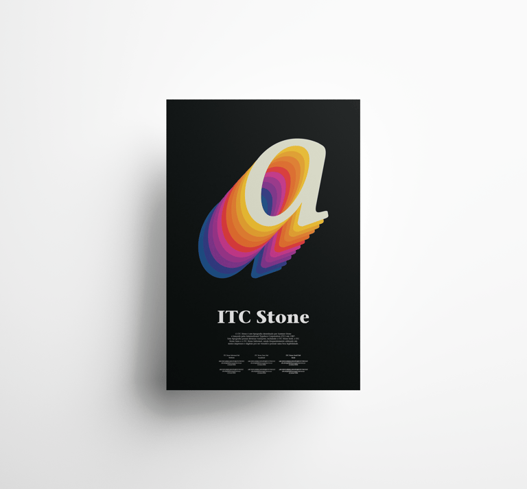
Typographic poster exploring ITC Stone, an 80s typeface designed by Sumner Stone. The concept draws from the visual language of the decade, showcasing its weight variation and history.
Project Description
Developed as part of the Typography course during my master's degree, the challenge was to create a promotional poster that brought the ITC Stone typeface to life. A black background sets the stage for a vibrant color palette, making each element stand out with sharp contrast. The letter "a" takes center stage, repeated in a color gradient that creates visual rhythm while highlighting the full range of the typeface's weights.
Technical Details
Tool: Adobe Illustrator
Context: Academic Project — Master's Degree in Design
Size: A2 (420 x 594 mm)
Year: 2023